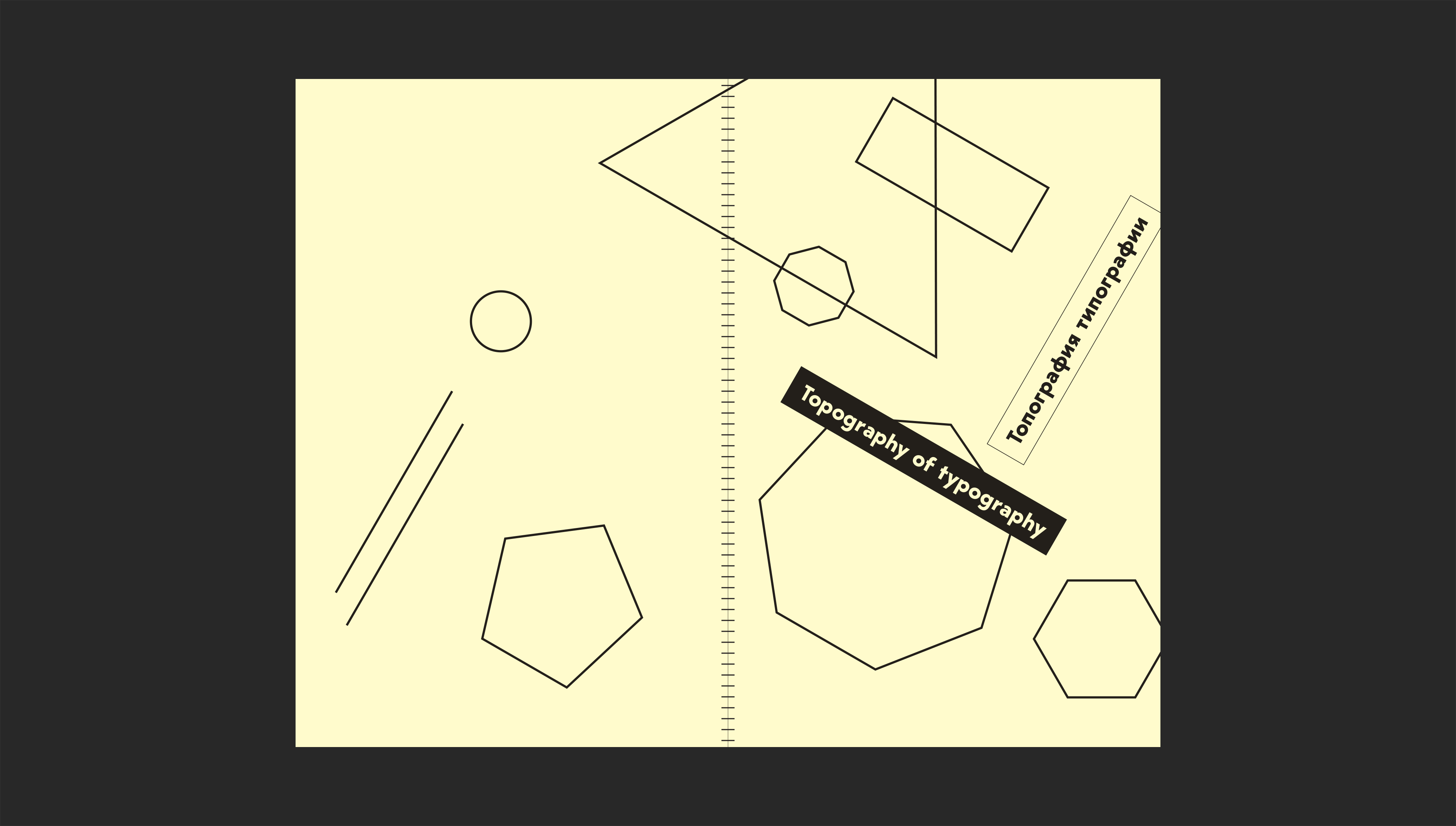
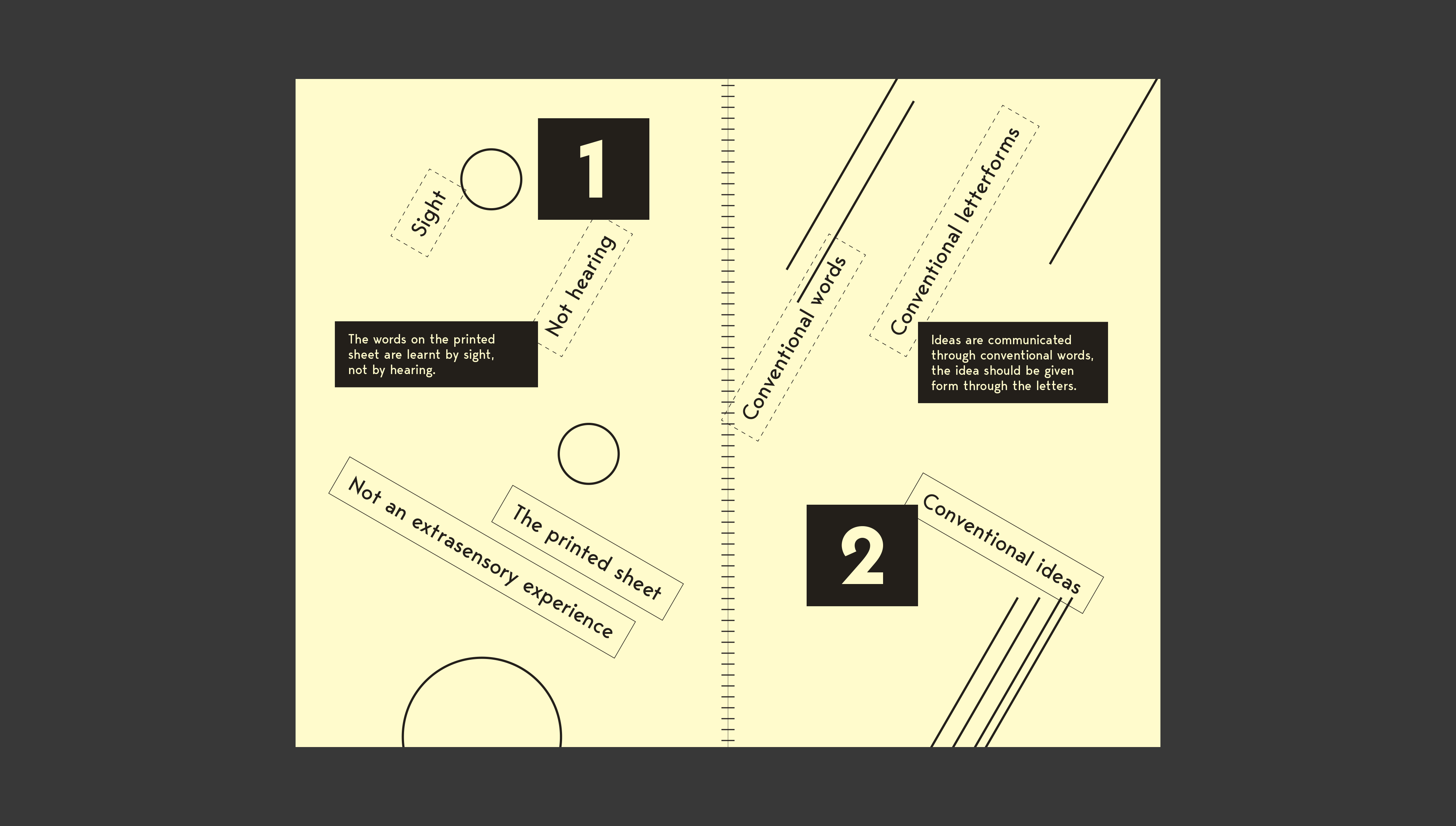
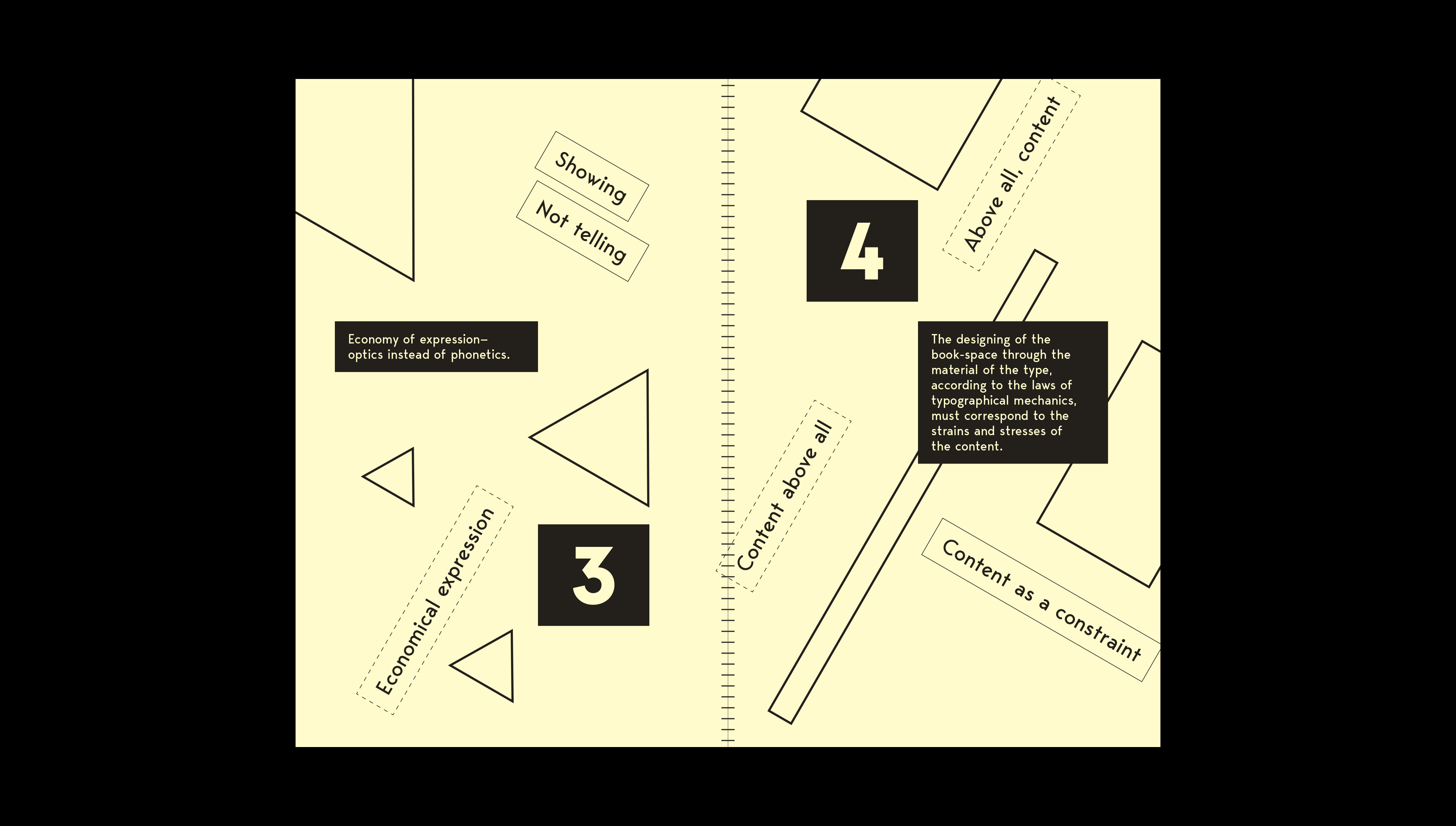
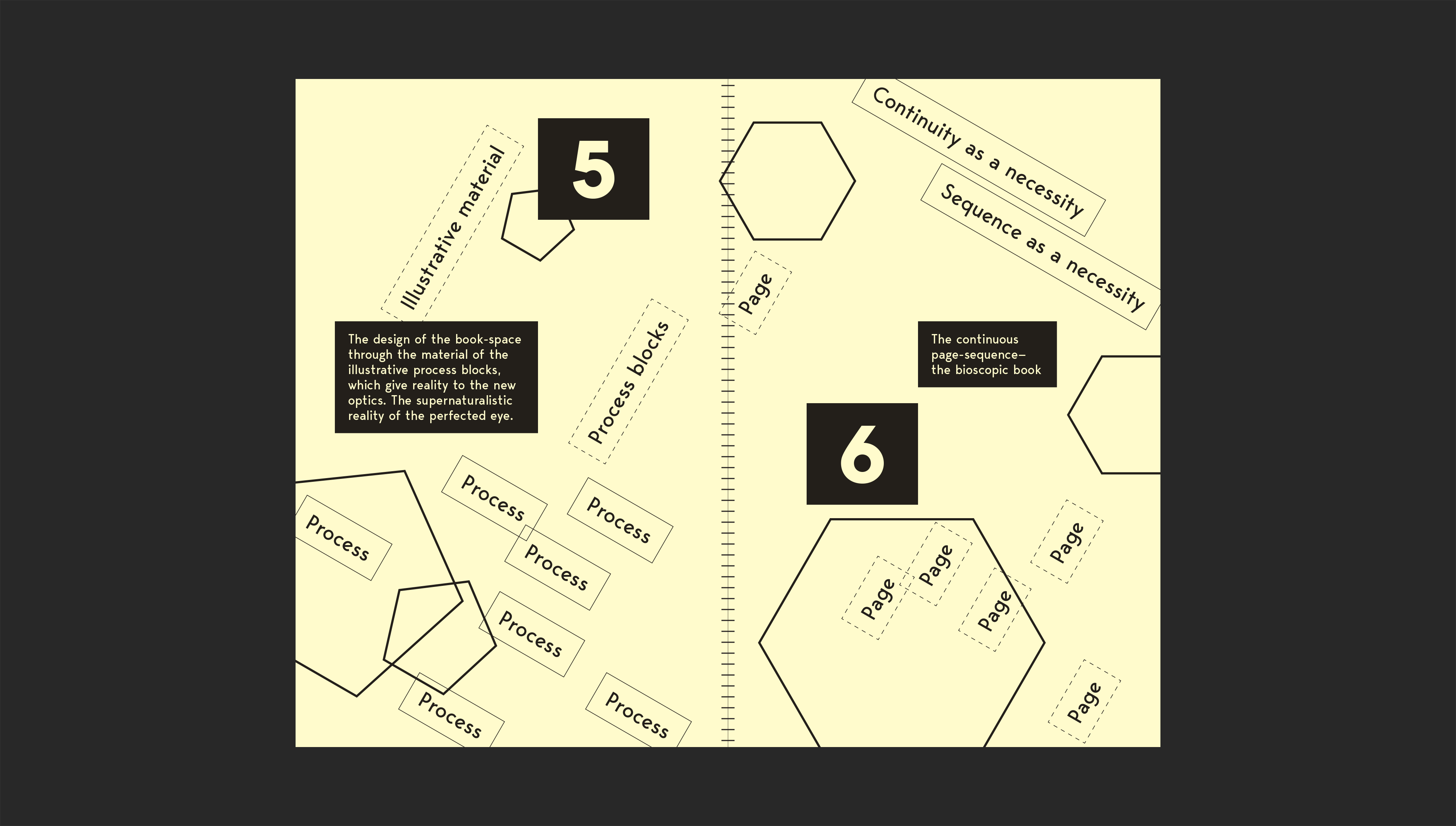
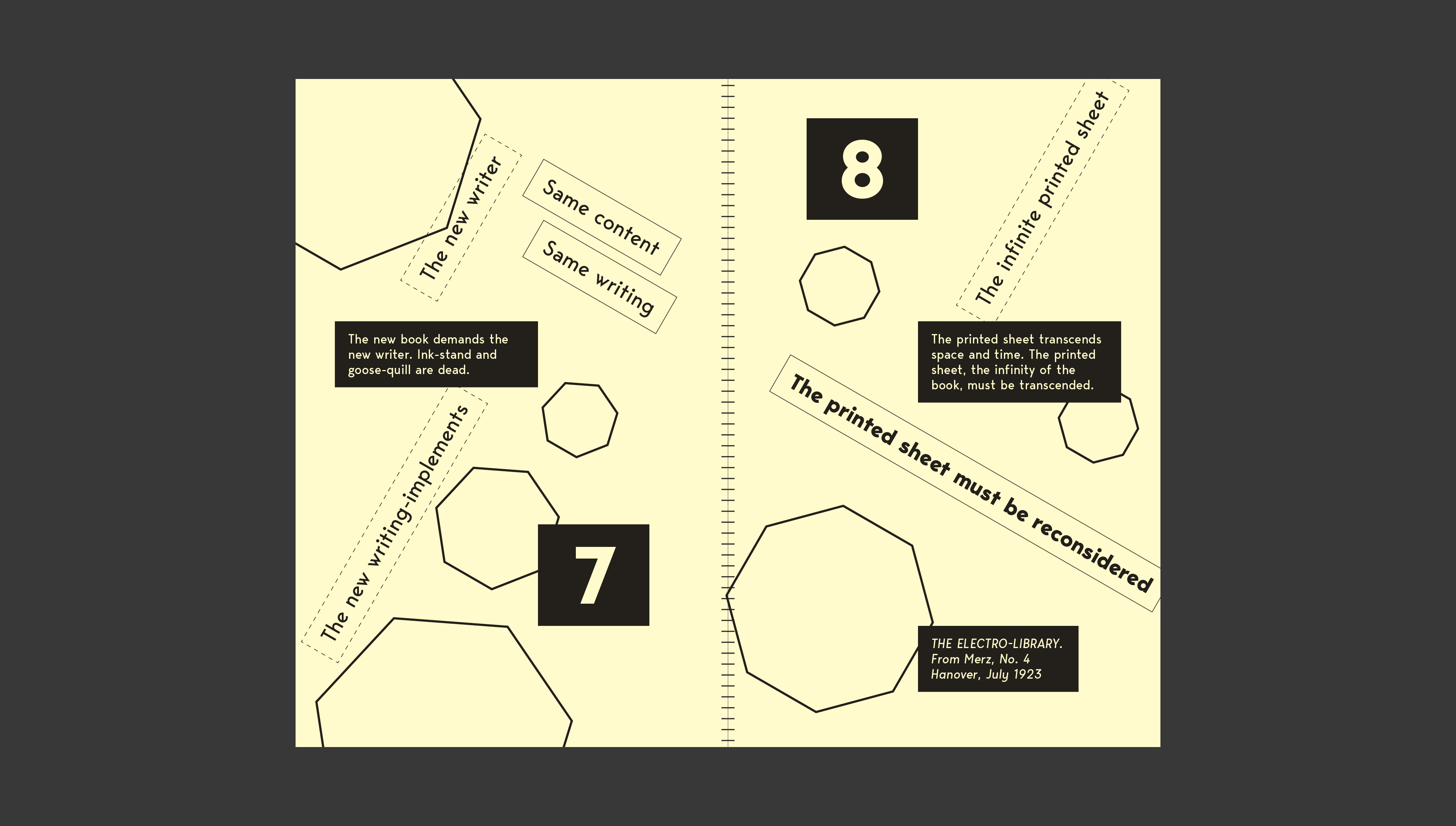
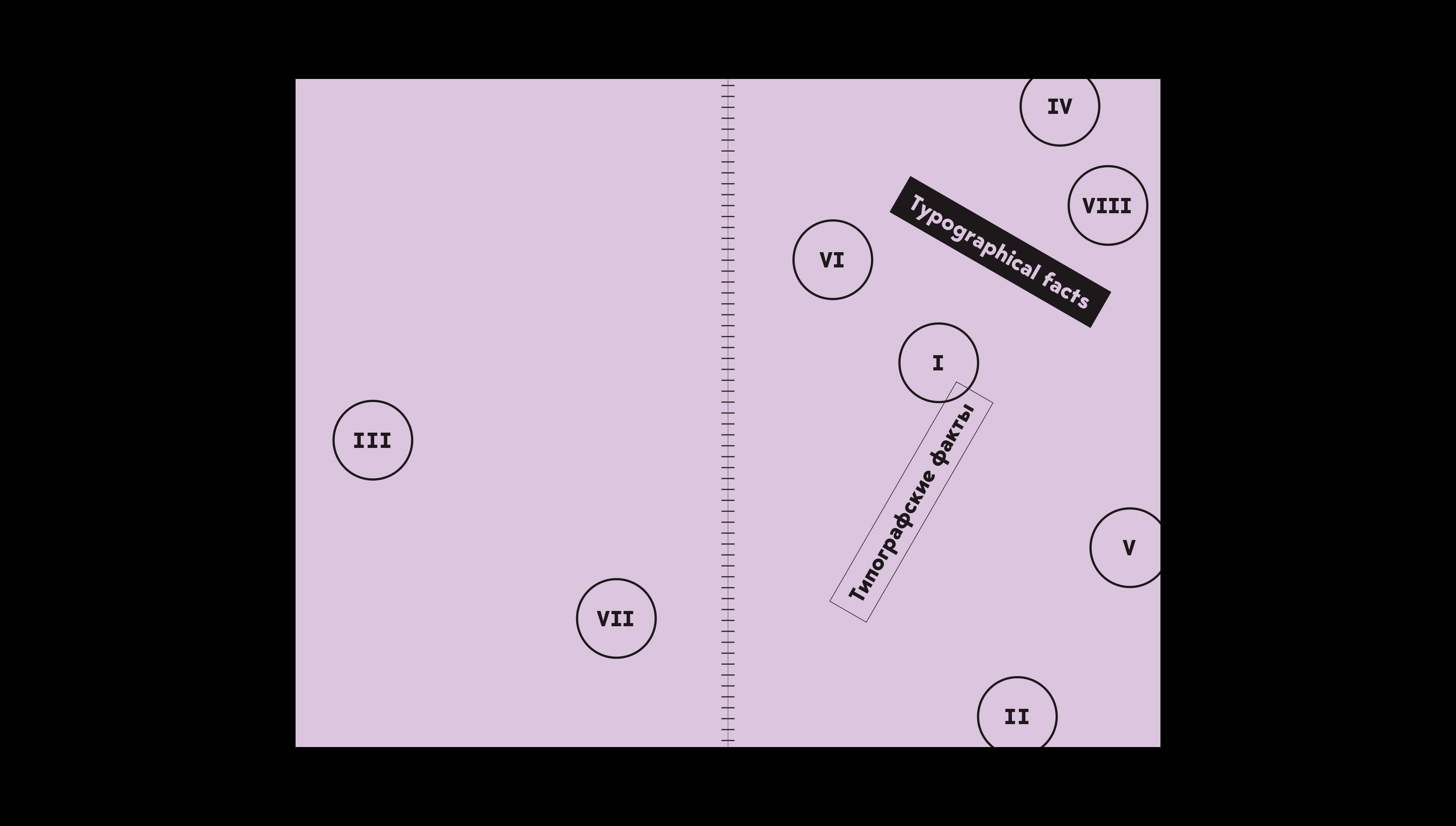
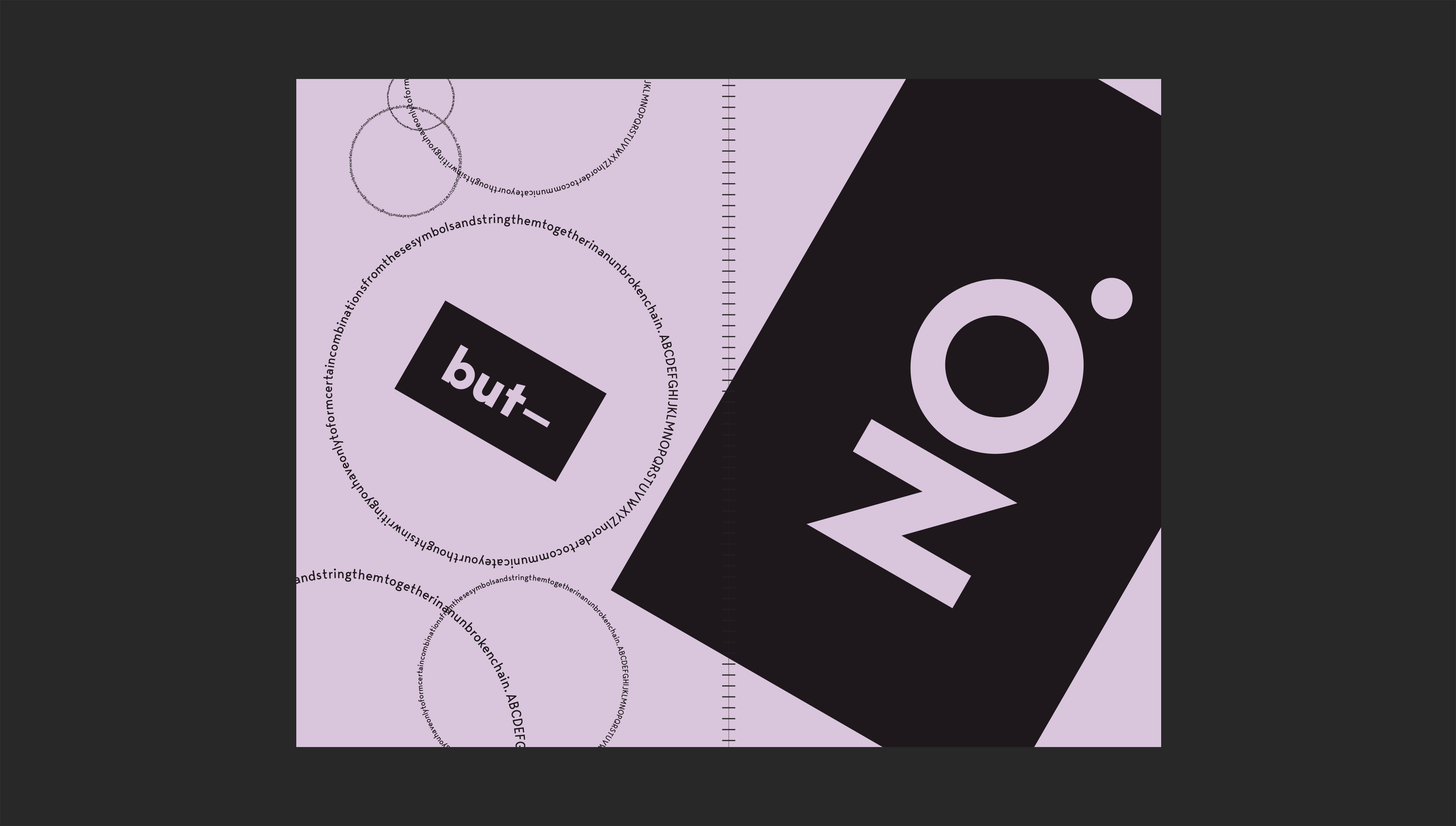
In two essays, “Topography of typography” and “Typographical facts”, Russian artist and designer El Lissitzky argued that the continuous progress of technology calls for a radical rethinking of how we approach printed material. The concept of “illustrated process-blocks”, thirty- and sixty-degree angles, simplified sans-serif type and geometric elements allude to the subject material without being didactically derivative. The final product is a set of two physical books, but the modular nature of the design allows the materials to possibly “transcend the book-space” and become something else entirely — reflecting the entire concept of the writing itself.
Typefaces used: Bergen Mono, Bergen Sans and Bergen Text.